Case Study - Design an app and a responsive website for parents to purchase and resell children's clothing.
Designing KidsKloset:
A Mobile Marketplace for Secondhand Children’s clothing
The Product:
This project focuses on designing a mobile app and responsive website that allows parents to easily buy and resell children’s clothing. The platform helps families save money and reduce waste by making it simple to find affordable second hand items and quickly list clothing their children have outgrown. The primary users are busy parents who want a convenient, trustworthy, and efficient way to manage their children’s constantly changing wardrobe needs.

The Problem:
Parents often struggle to keep up with how quickly their children outgrow clothing, which leads to frequent purchases and unused items piling up at home. Existing resale platforms can be time-consuming and complicated, making it difficult for parents to easily buy affordable clothing and resell items their children no longer need.
The Goal:
The goal of this project is to design an app and responsive website that allows parents to conveniently buy and resell children’s clothing in one place. The product aims to save parents’ time and money while creating a simple and trustworthy experience for managing children’s clothing.
My Role:
Lead UX designer responsible for conducting user research, defining the problem and goal statements, creating user personas and journey maps, and designing wireframes and prototypes for the app and responsive website
Responsibilities:
-Conducted user research to understand parents’ needs and pain points
-Created user personas and user journey maps
-Defined problem and goal statements
-Designed paper and digital wireframes
-Developed low-fidelity and high-fidelity prototypes
-Conducted usability testing and iterated on designs based on feedback
Understanding the User - User research | Personas | Problem statements | User journey maps
User Research: Pain Points
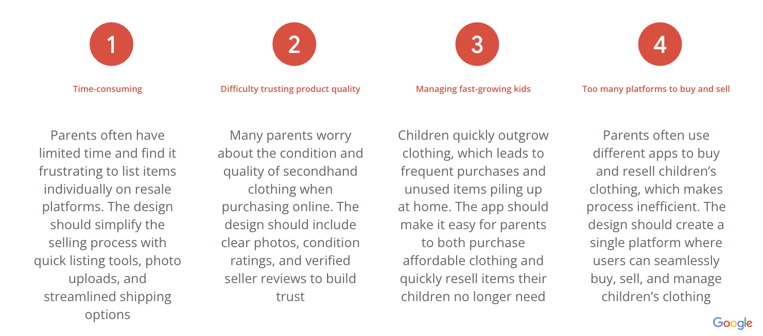
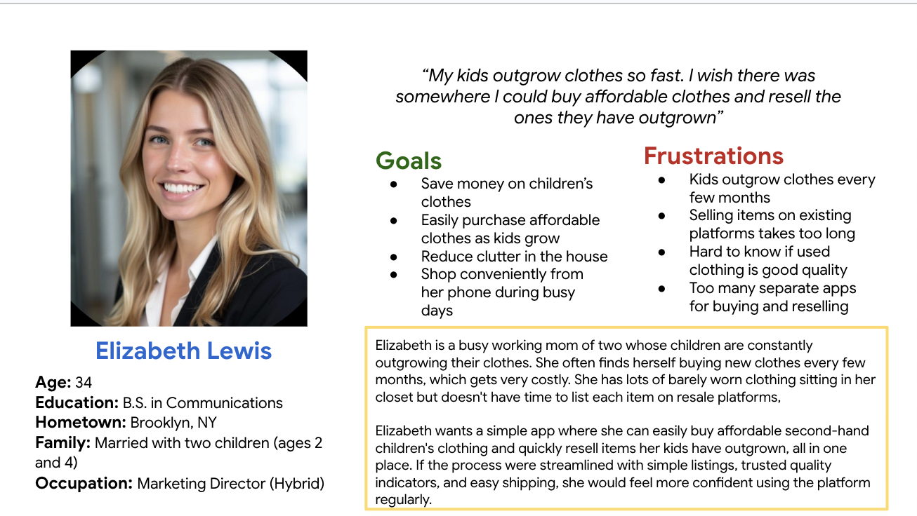
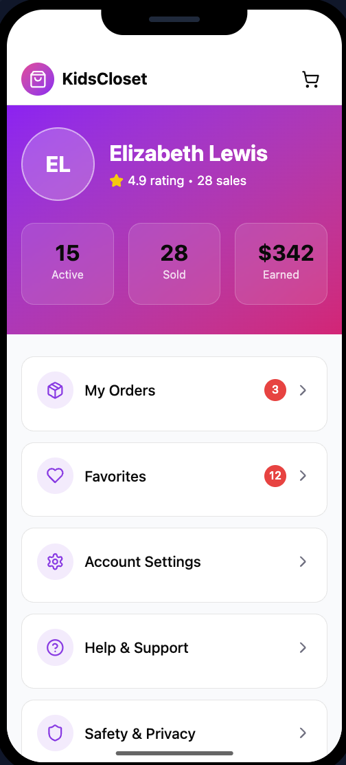
Persona: Elizabeth Lewis
Problem Statement:
[Elizabeth Lewis] is a [busy working mother] who needs [a simple and trustworthy way to buy affordable children’s clothing and quickly resell items her kids have outgrown] because [managing fast-growing kids’ wardrobes is expensive and existing resale platforms require too much time and effort].
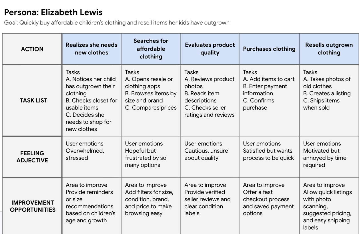
User Journey Map:
Mapping out the flow of Elizabeth’s user journey showed how she buys or sells children clothes step-by-step, how she feels, and where design improvements can help
Key Insights from Competitive Audit :
Parents need simpler selling flows → many platforms require multiple steps to list clothing
Filtering and search are critical → parents want to quickly find clothing by size, brand, and condition
Trust and quality control matter → platforms without verification create uncertainty about item quality
Most platforms are not optimized specifically for children’s clothing resale
Design Opportunities:
Based on the audit, I identified opportunities to design a platform that:
-Simplifies the clothing resale listing process
-Improves filtering specifically for children’s clothing
-Provides clearer product condition labels
-Builds trust through verified sellers and quality standards
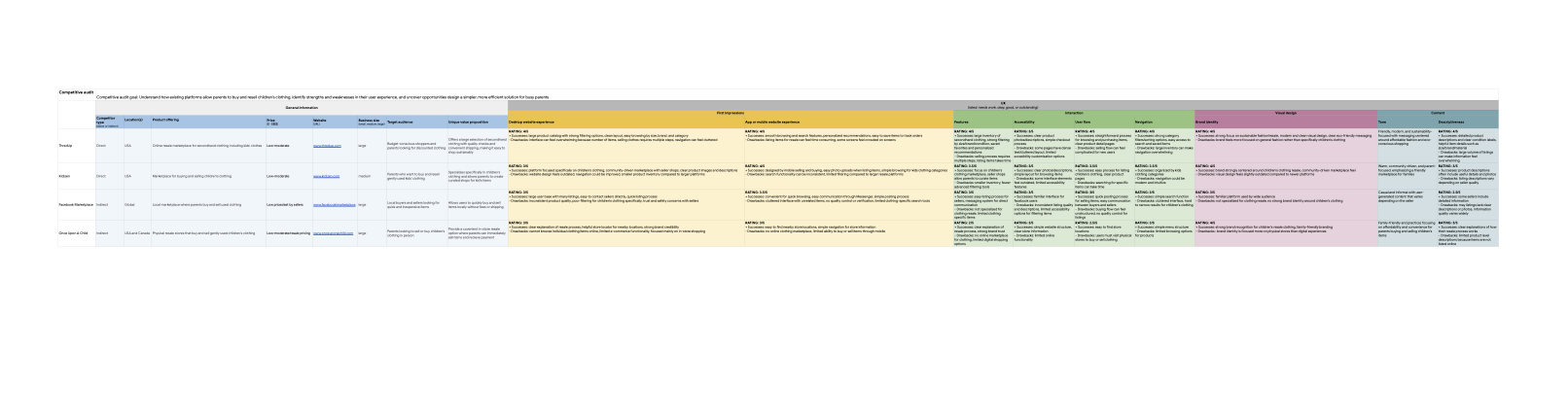
Competitive Audit
Goal: Understand how existing platforms help parents buy and resell children’s clothing, identify strengths and weaknesses in their user experience, and uncover opportunities to design a simpler and more efficient solution for busy parents.
Overview: I analyzed four platforms: ThredUp, Kidizen, Facebook Marketplace, and Once Upon A Child to understand how parents currently navigate the resale experience. I evaluated each platform’s usability, navigation, features, accessibility, and brand experience to uncover opportunities to create a simpler and more efficient solution for busy parents.
ThredUp - www.thredup.com
Type: Direct competitor
Strengths:
-Large Inventory
-Strong filtering by size, brand, condition
-Clean browsing experience
Weaknesses:
-Overwhelming amount of items
-Selling process requires multiple steps
Paper Wireframes:
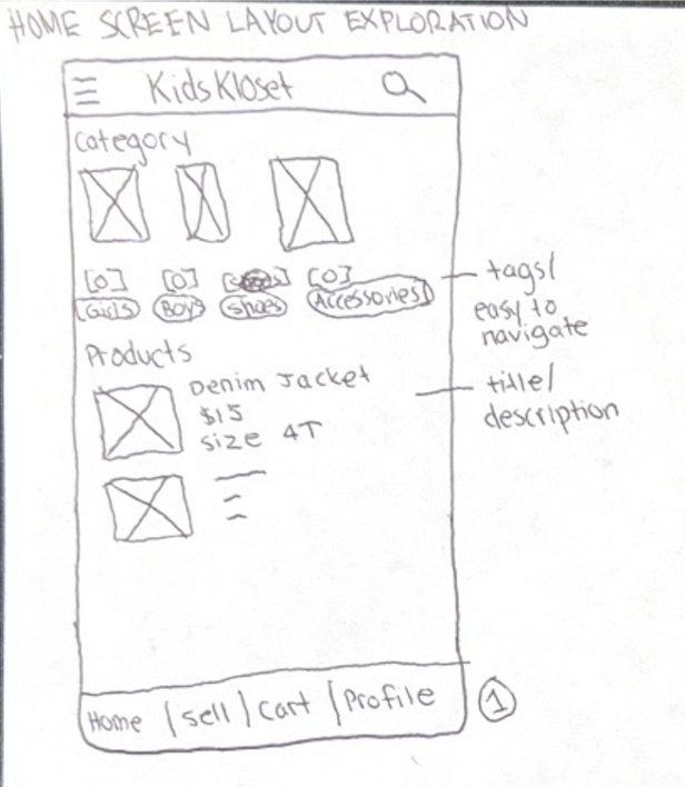
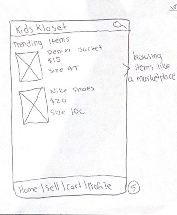
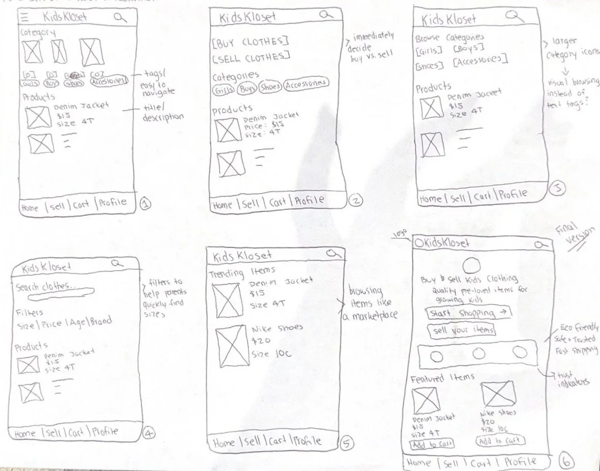
I created several paper wireframes to explore different layouts for the homescreen of the children’s clothing resale app. My goal was to make it easy for busy parents to quickly browse, buy ot sell items. I tested different placements for the search bars, category buttons, and featured listings to see which layout felt the most intuitive. After comparing five versions, I selected the design that prioritized quick navigation and product visibility.
Digital Wireframes:
After exploring multiple paper wireframe layouts, I created digital wireframes to refine the structure and hierarchy of the KidsKloset app. The goal was to make it easy for parents to browse or sell children’s clothing quickly. I prioritized clear navigation, category filters, and visible product information so users can find items efficiently. These wireframes helped organize the interface before creating higher-fidelity designs.
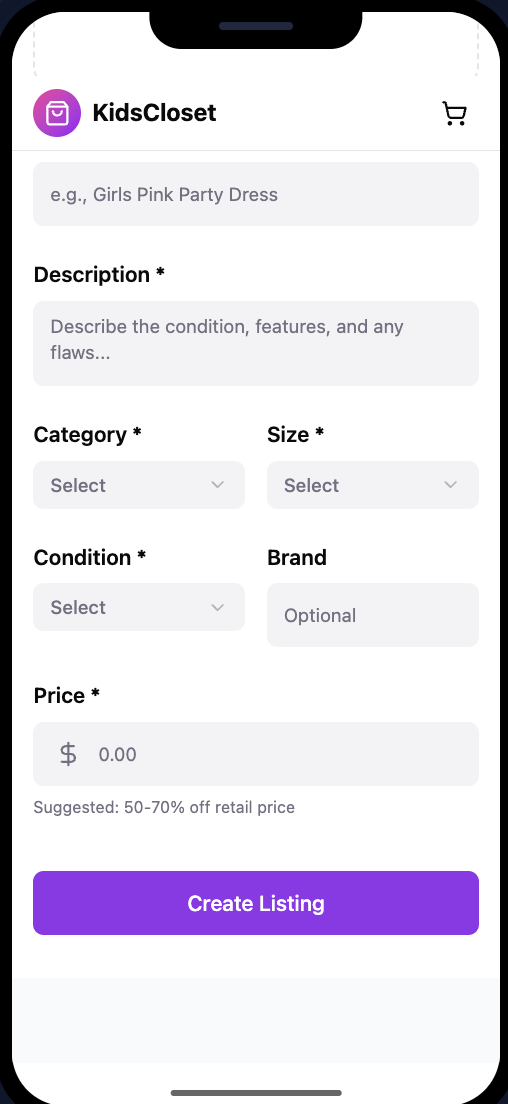
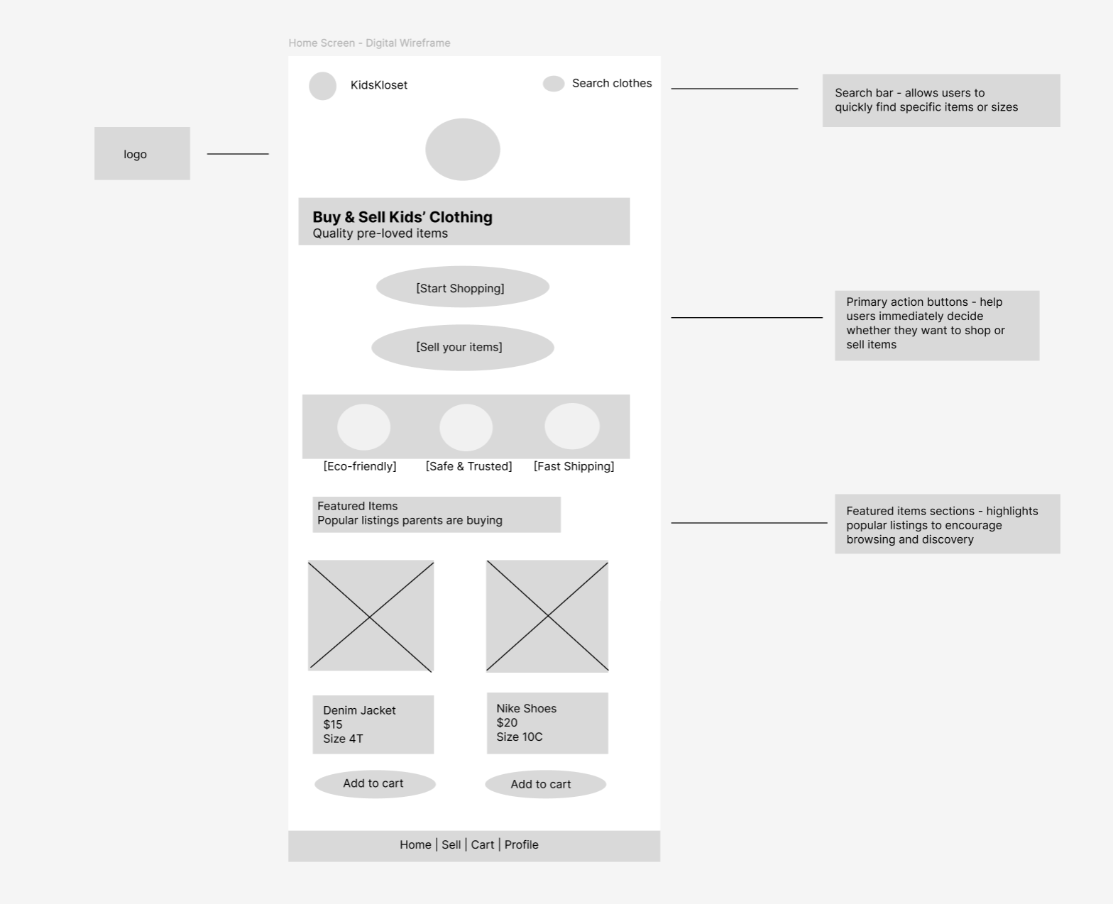
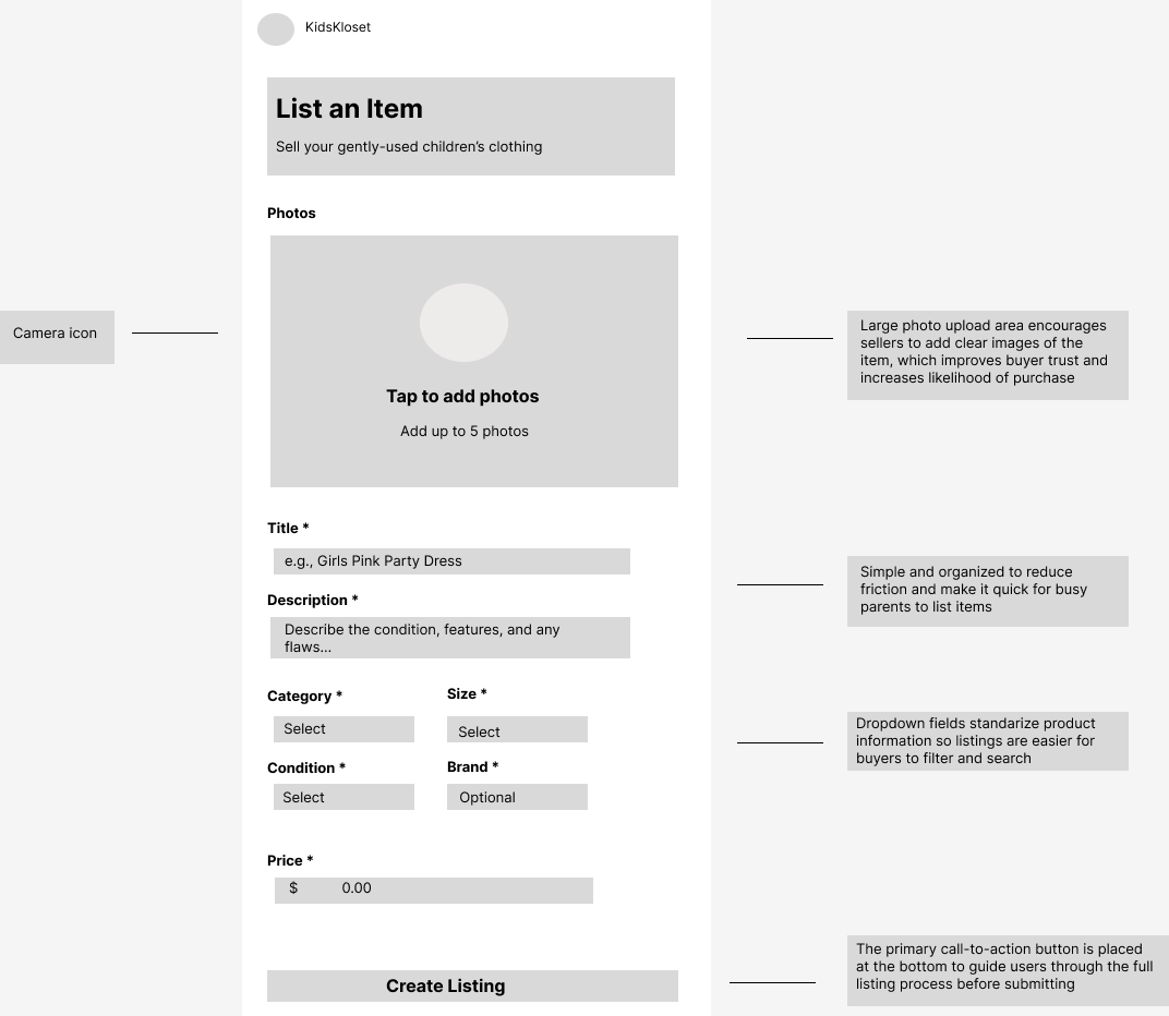
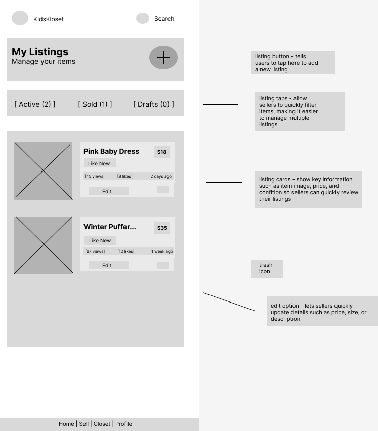
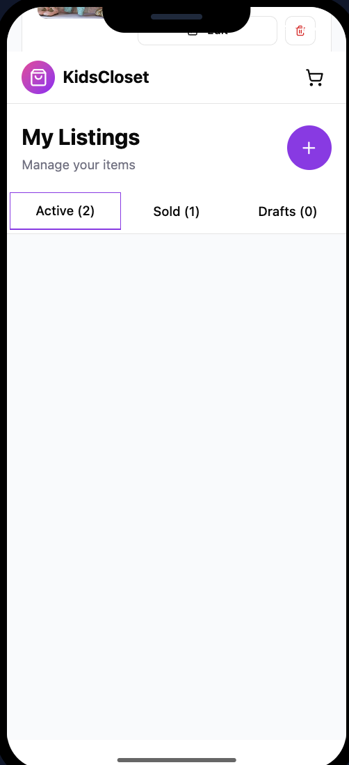
I created additional digital wireframes to support the selling flow of the KidsKloset app. The “My Listing” screen allows users to manage clothing items they are selling by viewing active listings, sold items, and drafts. Each listing card provides key information such as price, condition, and engagement metrics while allowing sellers to quickly edit or manage their items
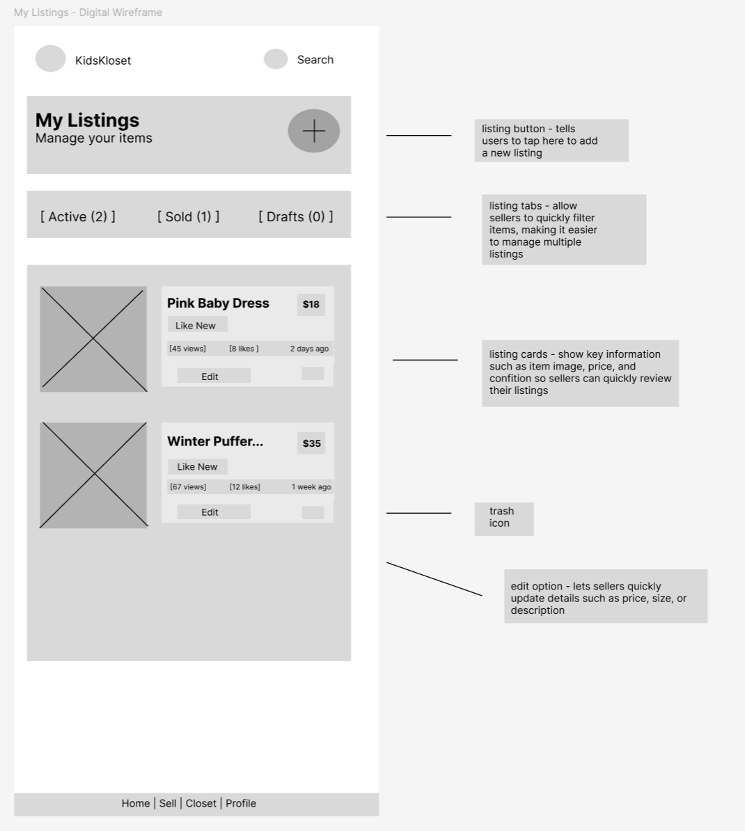
Low-Fidelity Prototype:
This low-fidelity prototype demonstrates the core user flow for parents buying and selling children’s clothing. Users can browse featured items on the home screen, view listings, and add items to their cart. Sellers can also manage and edit their listings through “My Listings” screen. The prototype focuses on creating a simple and efficient experience for busy parents.
Usability Study: Findings
I conducted two rounds of usability testing with participants who are parents to young children. The goal was to understand how easily users could browse children’s clothing, add items to their cart, and manage their own listings. The feedback helped identify areas where navigation and listing management could be simplified
Round 1 Findings
Users wanted clearer navigation between buying and selling → Some participants were unsure where to go if they wanted to sell items instead of shop.
Users relied heavily on search and filters → Participants wanted a quick way to find specific clothing sizes or brands.
Users wanted more information on product listings → Participants looked for details like condition, size, and price before deciding to purchase.
Mockups:
Based on feedback from the usability study, I made several improvements to the design to make navigation and listing management clearer for users. Participants initially struggled to quickly understand whether they should browse items or sell their own clothing. The updated mockups emphasize clear primary actions and improved organization of listings to help parents complete tasks more efficiently.
Before usability study - early paper wireframe exploring layout and navigation for browsing children’s clothing in the marketplace.
My Listings Mockup
The initial paper sketch explored how users could manage items they are selling. During the usability testing, participants expressed the need for a clearer way to track their listings and quickly edit items. The updated mockup introduced organized listing cards, clear status tabs for active, sold, and draft items, and improved layout hierarchy to help users manage their listings more efficiently.
Before usability study - early paper wireframe exploring how users could view and manage the items they are selling.
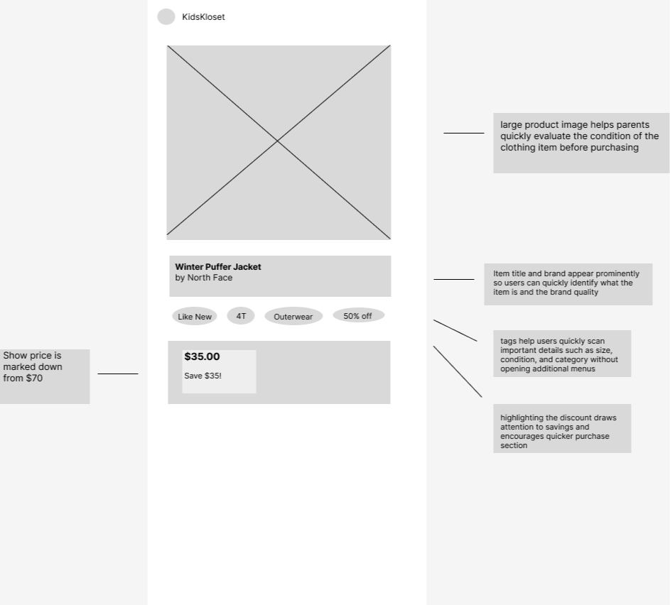
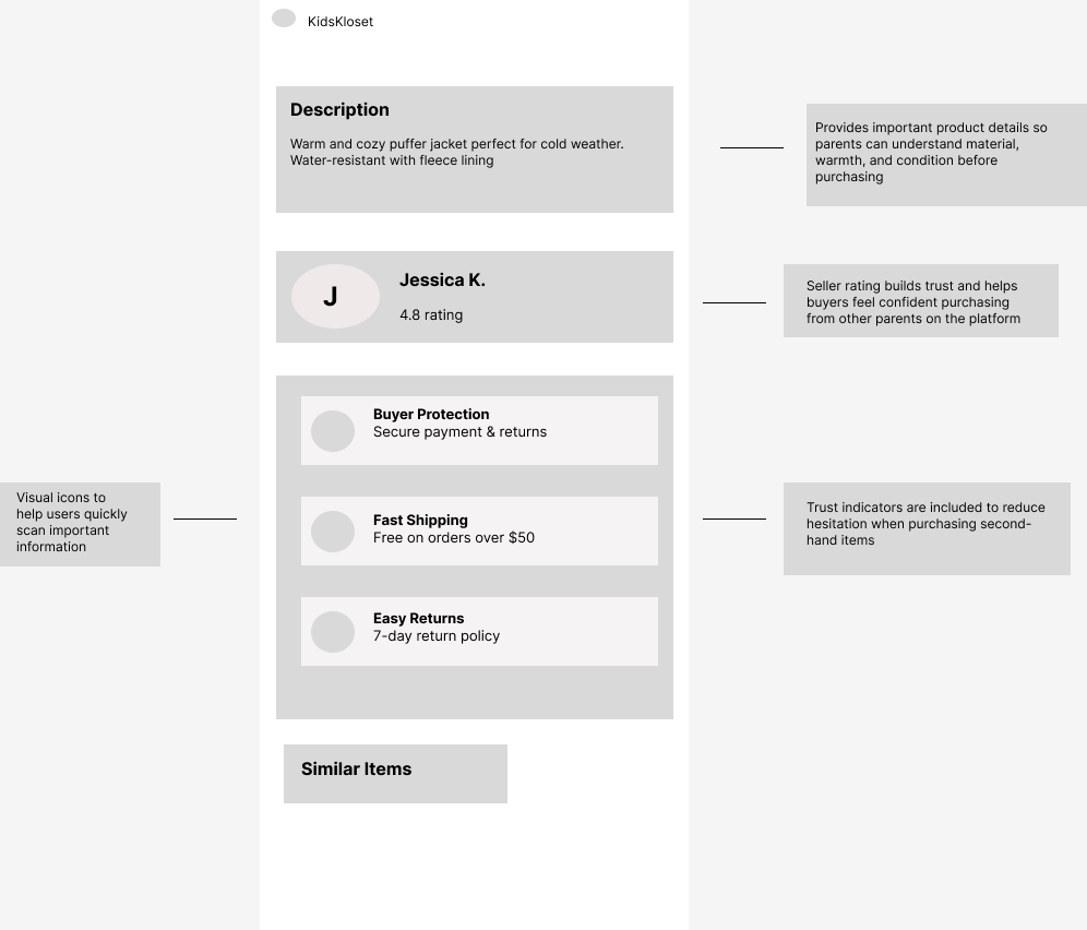
MOCKUPS: PRODUCT DETAIL PAGE
Kidizen - www.kidizen.com
Type: Direct competitor
Strengths:
-Focused specifically on children’s clothing
-Community marketplace feel
-Seller storefronts
Weaknesses:
-Smaller inventory
-Outdated design
-Limited filtering tools
How the Audit Influenced My Design:
The competitive audit revealed that many resale platforms overwhelm users with too many listings and complicated selling processes. To address this, my design focuses on a streamlined listing flow and simplified filtering tailored specifically for parents buying and reselling children’s clothing.
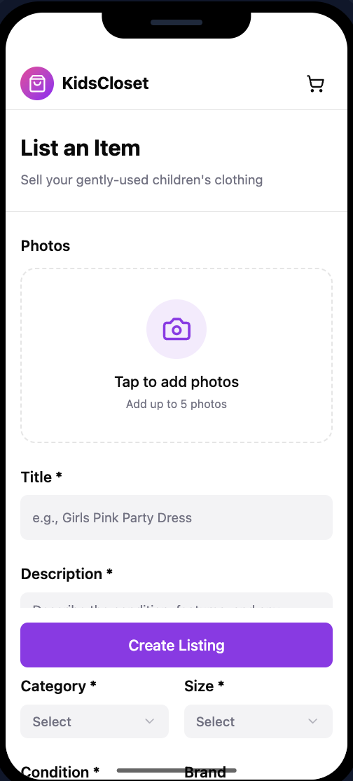
MOCKUPS - LISTINGS/SELL ITEMS PAGE
Project Duration: February 2026 - April 2026
User Research: Summary
I conducted user research to better understand how parents currently buy and resell children’s clothing and the challenges they experience. I used interviews and secondary research to learn about parent’s shopping habits, motivations, and frustrations. Before conducting the research, I assumed that parents mainly wanted lower prices when purchasing children’s clothing. However, the research revealed that convenience, trust in product quality, and the ability to easily resell outgrown items were equally important. These insights helped guide the design of an app that simplifies both buying and reselling children’s clothing in one place.
Starting the design: Paper wireframe | Digitial wireframes | Low-fidelity prototype | Usability studies
HOME SCREEN LAYOUT EXPLORATIONS
Round 2 Findings
The primary action buttons improved task clarity → Participants easily understood whether to start shopping or sell items.
The “My Listings” page made managing items easier → Users appreciated being able to see active, sold, and draft listings in one place.
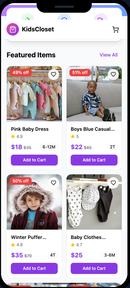
Featured items encouraged browsing → Participants were more likely to explore listings when popular items were highlighted.
Refining the design: mockups - high fidelity-prototype - accessibility
IMPACT:
The KidsKloset design provides parents with a simple way to buy and sell gently used children’s clothing in one place. By focusing on clear navigation, trust indicators, and an easy listing process, the app helps users quickly browse items and list clothing without friction.
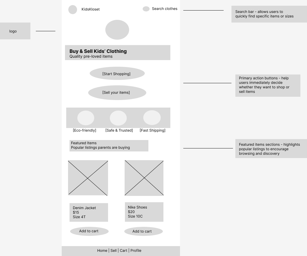
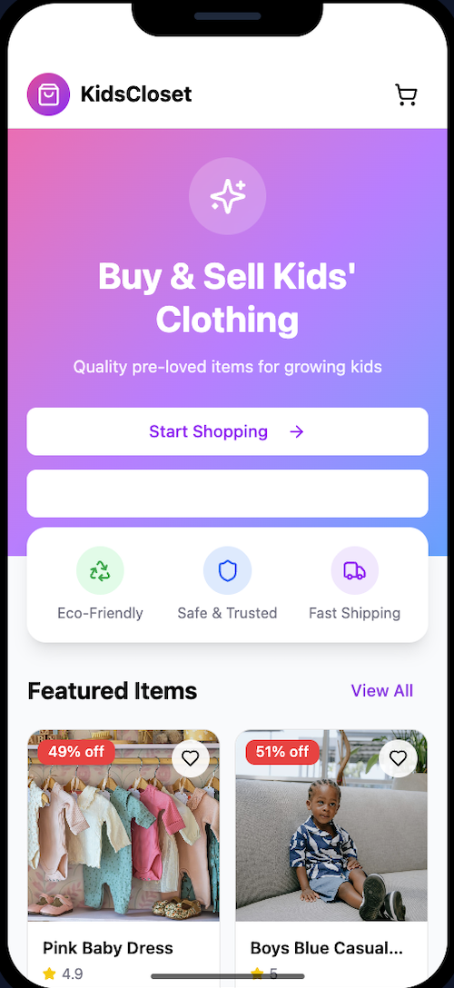
Home Screen Improvements
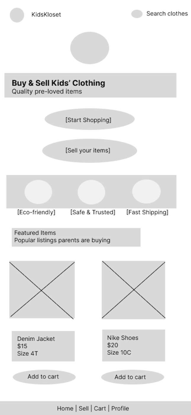
After usability study - refined digital mockup with clearer navigation, search functionality, and structured product listings to help users quickly browse items.
My Listings Improvements
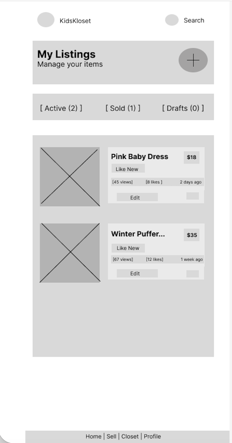
After usability study - updated digital mockup incorporating usability feedback, including organized listing cards and tabs for active, sold, and draft items.
Facebook Marketplace - www.facebook/marketplace
Type: Indirect competitor
Strengths:
-Huge user base
-Easy to list items quickly
-Local pickup options
Weaknesses:
-Poor filtering for children’s clothing
-Inconsistent product quality
-Trust issues with sellers
TAKEAWAYS
WHAT I LEARNED:
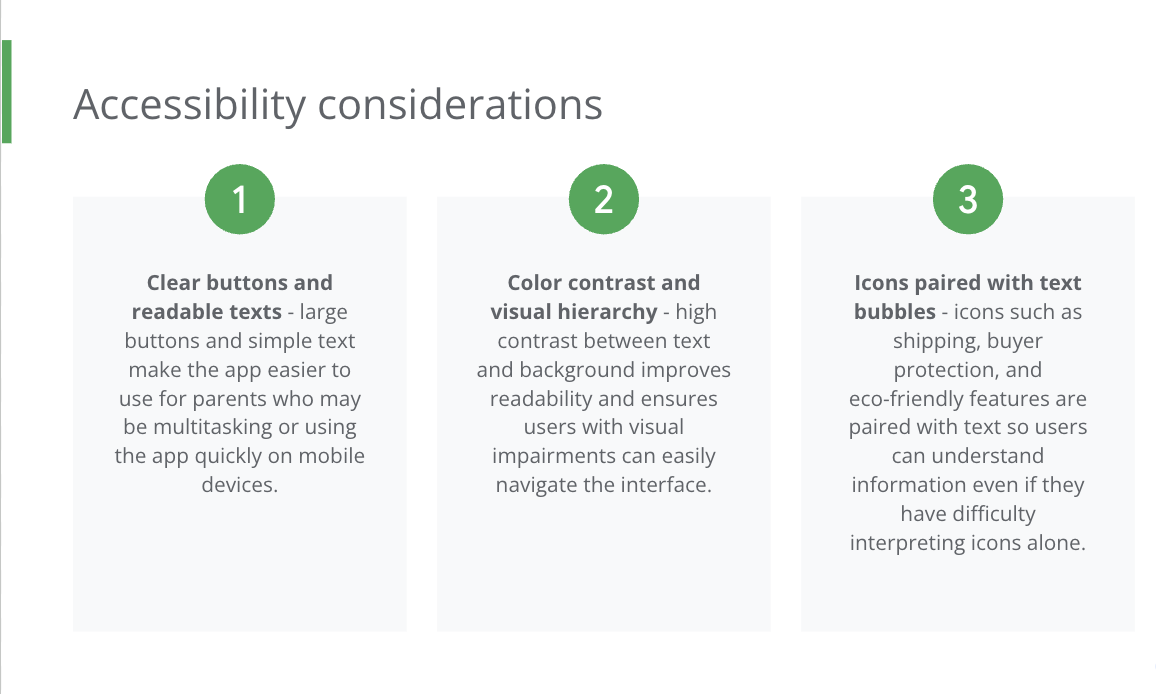
Through this project I learned how to move through the full UX design process, from research and wire framing to high-fidelity prototypes. I also learned the importance of designing for usability, accessibility, and simplicity to create a positive experience for busy parents using the app.
Once Upon A Child - www.onceuponachild.com
Type: Indirect competitor
Strengths:
-Strong brand recognition
-Easy in-person resale
Weaknesses:
-No online marketplace
-Limited digital shopping experience
Thank you for reviewing my KidsKloset UX Case Study. Im excited to continue developing my UX design skills and would love to connect with others in the design community!
Email: carolinefoxman97@gmail.com
LinkedIn: Linkedin.com/in/caroline-foxman